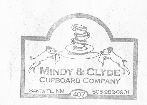
Their signage had me at hello. How darling is that logo? The inside of this store is just as charming. Vintage dishes, tablecloths, and housewares galore. The owner was super friendly and we chatted about dogs and dishes. Anyway, I bought a planter just to get the bag! Then I proceeded to save the bag for the next 3 years. I always knew that I was going to "make something" out of it.
And, I finally did.
With the high ceilings and vast white in this apartment I knew I wanted something big and graphic for our one blank wall. I thought of a Ken Baily painting. They combine my love of advertising and dogs. That's when I remembered my Mindy & Clyde bag and I decided to make my own painting. First off, it's custom for our colors and the size of our space. Secondly this painting reminds me of our trip to Santa Fe. It was our best vacation to date.
So that is the sweet story behind our new "art" and now here are the behind the scenes details.
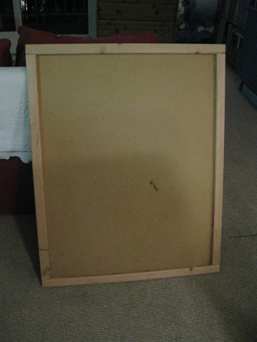
This jumbo sized painting started it's life as the backing of an IKEA Billy bookcase. After the move, I relegated that bookcase to our pantry closet. The backing was falling off, so I removed it and bolted the bookcase straight to the wall.
Not one to waste, I saved the 30" X 38"board specifically for an art piece for the dining area wall.
To give it the thickness of a real artist canvas I cut and nailed thin pine furring strips to the back.
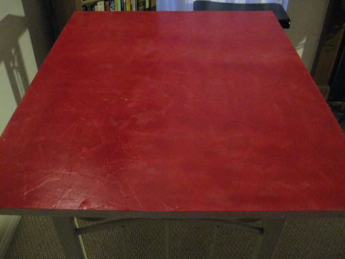
Then I covered the whole thing with Modge Podge and manila paper from school. This gave it a bit of texture and covered the furring strips.
I painted a layer of red spray paint, a layer of brown left over kitchen paint, a layer of white spray primer
and finally a layer of Rust-oleum "Moss" spray paint. I sanded the whole thing down to give it a worn look.
You can see the texture and worn finish here.
To size the image I scanned the bag and turned the picture into a "pencil drawing" on Picnik.
Under the "properties" tab in the print menu there is a "page layout" tab. In that tab there is a multipage printing section which includes "poster printing." I used that function to print the picture to size. Then I taped all the pictures together.
I cut out the frame and colored heavily with a pencil on the back of the design. I traced over the entire design to transfer it to the "canvas." Next, I painted the design with acrylic paint. This had to be done in daylight as the lines were very faint and hard to see. During this stage, I was really wishing I had a Silhouette machine! (Although, now that it's done, I don't mind the uneven hand painted quality.)
When the painting was done, I sanded it down to distress it further.
These are all night time photos. I will update with some daylight pictures soon.
At just about $6 for the furring strips and spray paint, this project definitely qualifies for "Frugal Friday" at the Shabby Nest! I am off to check it out now! Have a great day!


Here is another party I am going to join. With this one I hope to win some really adorable baby shoes for one of my nieces to be. Also, amazing ideas! I've spent an hour browsing and added half a dozen projects to my to do list!

Love the CSI Project! Lots of great ideas there!


17 comments:
All I can say is WOW! That is awesome. With Joy, Carey
I love it! You are so resourceful. :)
Thank you for mentioning the picnik feature. I have always just resized things by hand - making my own large graph paper and putting the original into squares that make it easy to copy. This will make life so much easier. I love your result!
Very cute! I love how it reminds you of your favorite vacation too :)
cute sign great idea. love the green
you are a craft genius. i'm serious!!! i love that you use everything- that you find new used for old things. that you take a logo on a bag and turn it in to a great art piece... go girl!
great project! I'm always looking to make large art on the cheap! WOW!!! Found you from tatertots and jello!
It looks great! To answer your question about the finish of my walls I need to double check but I am pretty sure it is either egg shell or satin. I know it isn't flat. The paint I used for the stencil was satin or egg shell mixed with white gloss to give it sheen. I am not familiar with "knock down walls." What kind of finish is it? :) Kerstin
I just found your blog thru Tatertots and Jello! What an awesome sign. I am addicted to signs; there are just so many possibilities! Please come check out my blog at www.willowcreeks.blogspot.com Can't wait to read more of your blog!
How much do I love this sign! It is amazing - the image is fantastic and you did a great job recreating it.
Thanks for the comment on my blog...It totally clicked and I remember talking to you (and I think I talked to 300 people today)!
Holly
You get a big ol' WOW from me.
You never cease to amaze me! It's perfect. You need to send them a photo, they will be thrilled. :)
That's so awesome! I LOVE it!
Super, super cute! Thanks for stopping by my blog!
I love the colors you used. It turned out awesome!
awesome project! I never knew about the poster print out option - totally gonna check that out! well done!
Wow! Great project! I've never known about the poster print option. Thanks for the tip!
Post a Comment