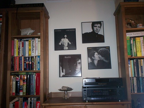
At first, Cliff approached his rotating decorating project with the theme of "Guitarists from the 60's who were still rocking in the 80's." As you can imagine, those guitar "heros" with 20 year careers had images of themselves rock'n it out splashed across their album covers. While the narrative theme of that concept was strong, most people (meaning pretty much only me) looking at our wall wouldn't appreciate it. That display would be cool at someplace like a record shop.
"I don't want to take over your decorating project, and I really don't care what you do, but maybe you could focus on aesthetics."
I think this modern display of black and white albums is really nice and I tried to complement it with a rock display of my own.

It looks very elegant,
ReplyDeleteThose black and white albums look nice. I love your heart-shaped rock collection.
ReplyDeleteI love the black and white theme, I think it's retro and modern at the same time, good work. I might have to steal the idea from you. Thanks
ReplyDelete